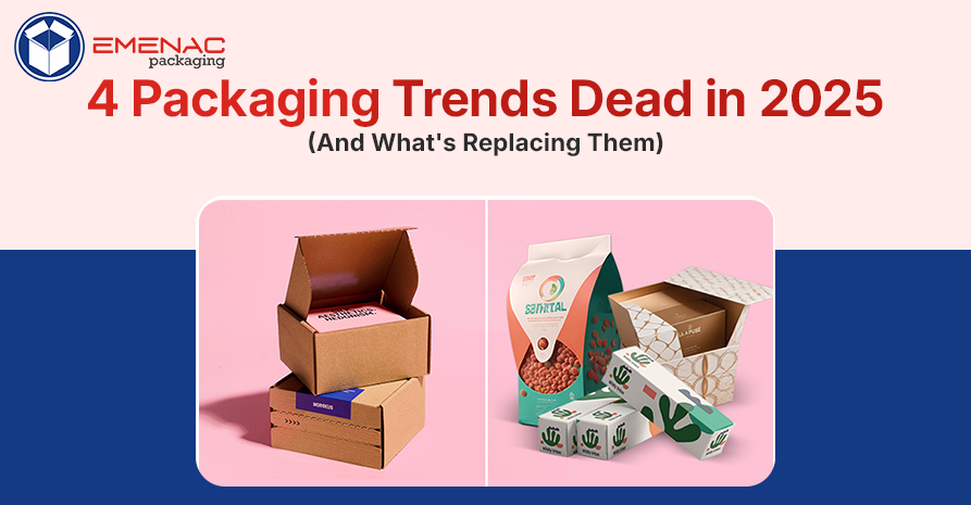
4 Packaging Trends Dead in 2025 (And What's Replacing Them)
The packaging industry is evolving, and with every passing day, trends are changing. Something felt fresh and exciting a couple of years ago, but now looks outdated.
Brands that fail to keep up with the latest trends will eventually lose their reputation and credibility. While walking down a grocery store or scrolling through product launches, you may notice that outdated packaging is fading away.
There are 4 main packaging trends dead in 2025 and what’s taking their place. To know, keep reading.
4 Packaging Trends Dead in 2025 & What’s Taking Their Place
Minimalist White Everything
Remember when every brand decided to go full Apple? Stark white backgrounds, tiny sans-serif fonts, and acres of space. It looked clean at first. Then everyone did it. Now your protein powder looks like your face cream looks like your supplements looks like your cleaning products.
The problem isn't minimalism itself. It's that white minimalism became shorthand for "I'm too lazy to develop an actual identity." Brands thought removing personality made them look premium. Instead, they disappeared into a sea of sameness.
What's replacing it: Colour is back, and it's not apologising. Deep terracotta for earthy products. Unexpected purple for wellness items. Jewel tones that catch your eye without screaming.
The new approach pairs bold colour with thoughtful restraint. You get visual impact without chaos. Brands are learning they can stand out AND look grown-up at the same time.
Kraft Paper for Everything
Kraft paper became the universal signal for "we care about the planet." Coffee bags, custom soap boxes, chip packaging – if it was brown and textured, it must be good for Earth, right?
Wrong. Most custom-printed Kraft packaging isn't actually more sustainable than alternatives. Some products wrapped in kraft actually need additional plastic barriers inside, creating more waste, not less. But the real issue is that Kraft became a costume brand that wears to look eco-conscious without doing the hard work.
Customers got wise to this. Greenwashing doesn't fly anymore.
What's replacing it: Real sustainability that you can verify. Brands are getting specific about their materials – "made from 80% post-consumer recycled ocean plastic" hits differently than vague "eco-friendly" claims. You're seeing certifications displayed prominently. Carbon-neutral shipping badges. Actual composting instructions.
The packaging itself varies wildly now. Some brands use clear materials so you can see the product quality. Others experiment with mushroom-based packaging or seaweed films. The common thread isn't the look – it's legitimate commitment backed by proof.
Fussy Vintage Typography
The hand-lettered, old-timey label trend had a good run. It worked when a few craft brands used it to stand out from corporate polish. Then everyone from startups to major corporations slapped on some script fonts and vintage frames. Your "artisanal" water bottle started looking like a Civil War-era medicine label.
This aesthetic relied on borrowed credibility – acting like your three-month-old company has been around since 1887. People see through it now. They want authenticity, not theatre.
What's replacing it: Type that's actually readable and modern. Designers are embracing geometric fonts, unusual letter spacing, and layouts that feel current. Some brands play with size contrast – huge bold words paired with tiny details. Others go for clean, confident typography that doesn't need ornament to feel premium.
The focus shifted from "looking old" to "looking good." A strong typeface on a solid colour background can convey more personality than all the flourishes and filigrees in the world. Function matters again.
Overloaded Information Panels
Brands panicked about transparency and dumped everything onto their packaging. Twenty different certifications. Paragraphs explaining their supply chain. Icons for every possible dietary restriction. The result? Packages are so busy that you couldn't find the product name without a search party.
This came from a good place. Customers wanted information. But there's a difference between being helpful and being overwhelming. When everything is highlighted, nothing is.
What's replacing it: Smart hierarchy and digital integration. Leading brands now feature the critical stuff on the front – what it is, why it matters, maybe one standout claim. The rest lives on a QR code that takes you to detailed information online.
This approach respects both types of customers. Quick grabbers get what they need at a glance. Deep researchers can explore ingredients, sourcing, recipes, and usage tips on their phones. The physical package stays clean while the information stays accessible.
Some companies take this further with AR features or apps that unlock when you scan the package. You might see how the product is made, learn about the farmers who grew ingredients, or access exclusive content. The package becomes a portal instead of a pamphlet.
Final Thoughts!
These 4 packaging trends dead in 2025 share something in common, but they were shortcuts. Brands wanted to signal certain values without earning them. They borrowed looks without developing substance.
What's replacing them demands more work but delivers better results. Real sustainability over performative eco-aesthetics. Genuine personality over borrowed nostalgia. Useful information over information dumping.
The packaging winning in 2025 knows what they are and isn't afraid to show it. They respect customers enough to be honest and smart enough to be clear. That's not a trend. That's just good design finally catching up to what people actually want.
Share This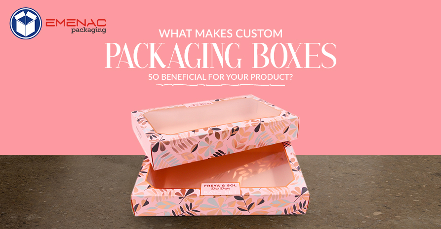 What Makes Custom Packaging Boxes so Beneficial for your Product?
 How Window Soap Boxes are Valuable for Your Brand Success?
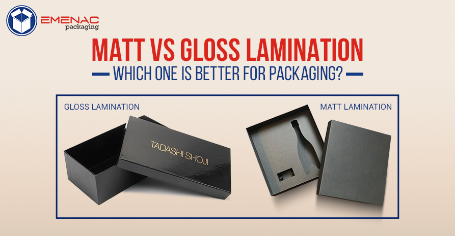 Matt Vs Gloss Lamination: Which One Is Better For Packaging
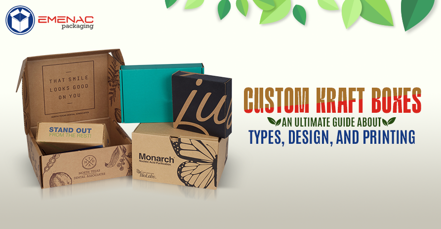 Custom Kraft Packaging Boxes: An Ultimate Guide about Types, Design, and Printing
 Top 5 Reasons Why Small Businesses Use Custom Printed Gable Boxes