
Biggest Logo Mistakes Brands Make on Packaging & How to Avoid
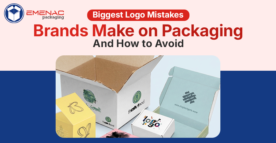
The brand logo is the first thing customers see and the handshake of your business. It represents your identity even before you speak anything.
But what if your logo looks simple, cheap, confusing, or anything that can’t catch anyone’s eye at first glance? Verily, the first impression will not be good.
This time, the logo mistakes brands make on packaging that cost them in multiple ways. And unfortunately, many of them don’t know that the poor logo is the main culprit behind costly errors.
This blog post highlights those logo mistakes that may look small but are bigger in reality. We will also guide you on how you can avoid them.
Main Logo Mistakes Brands Make on Packaging
1. Over & Complicated Design
Simple always looks beautiful. When brands combine a simple logo with multiple elements, it looks confused and weird. For one, such a logo can hinder its ability to convey the message customers want to know about your brand.
Additionally, the visual impact of your logo might be affected by an overly complicated design. And the most important thing is confusing logo is not able to be reproduced accurately across multiple printing techniques.
How to Avoid?
Limit colours, fonts, and visual elements. Use the 60-30-10 rule: 60% whitespace, 30% primary elements, 10% supporting info.
2. Poor Scalability
Sometimes, the brand logo that appears on the website looks perfect, but it is blurry on your packaging. That is an example of poor scalability of your brand logo. And if your logo does not have good scalability, it eventually loses its professionalism and impact.
Your logo should be versatile enough to use in an omnichannel marketing landscape. If the logo appears perfect in one place but is blurry and hard to see or read in another place, people get confused.
How to Avoid?
Focus on simplicity rather than thinking about using intricate, overly complex elements.
3. Logo Competes with Other Elements
On packaging, every single element fights for attention. And when brands want to do their best in every element, visual chaos happens that disturbs the appeal of the main element, named the logo.
When the logo competes with other elements, it looks unprofessional, which overwhelms customers. Additionally, if your logo is competing instead of leading, you are not utilising space correctly.
How to Avoid?
Put your brand logo first, then design other elements strategically. Use space wisely so that your logo leads, not fights for attention.
4. Logo Placement is Awkward
Placement influences perception, and a well-placed logo looks professional. What if your logo design looks fine but the placement is incorrect? Absolutely a waste of effort.
Bottom corner, centered weirdly, taking up half the front panel, and off-center in a way that throws off the entire design balance are a few examples of awkwardly placed logos. And these types of logos don’t feel premium and confuse customers about where to look first.
How to Fix?
Place the logo traditionally, and the most appropriate places are top-left and top-center. The second main thing is hierarchy. What should the customer want to look at & read first? And then make changes.
5. Unreadable Logos
An unreadable logo at a small size makes people confuse what your brand truly is. Some logos look impressive on websites but are hard to see or read in reality. Unreadable logos look overly detailed with thin fonts & complex illustrations.
When your beautiful logo lacks the right font and illustrations, it looks blurry. Thus, brands must design a readable logo at an accurate size with perfect placement. Without it, products often get ignored on shelves.
How to Fix?
Understand your substrate before you finalise colours. Does a test before going for bulk designing. Remember Pantone colours print differently on different finishes.
Ending Thoughts !
Your brand logo on your packaging speaks volumes long before your customer touches your products. Mistakes most commonly occur in the design phase by creating your logo without considering scale, colour, placement, and hierarchy.
Before your next production cycle, try testing your logo on your packaging in real-life size on the actual material. Place it strategically so that it is clear and recognisable as your logo. Avoid these logo mistakes brands make on packaging.
Are you ready to make your packaging perfect for your brand? Let's discuss ways to design your packaging so that your logo really shines. Contact Emenac Packaging New Zealand today.
Share This What Makes Custom Packaging Boxes so Beneficial for your Product?
 How Window Soap Boxes are Valuable for Your Brand Success?
 Matt Vs Gloss Lamination: Which One Is Better For Packaging
 Custom Kraft Packaging Boxes: An Ultimate Guide about Types, Design, and Printing
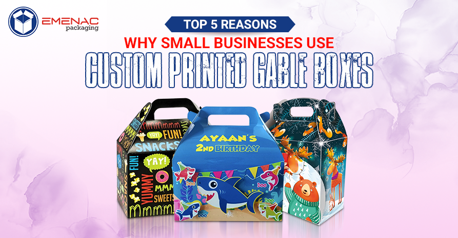 Top 5 Reasons Why Small Businesses Use Custom Printed Gable Boxes