
Halloween Colour Psychology: Mistakes That Cost Brands Sales
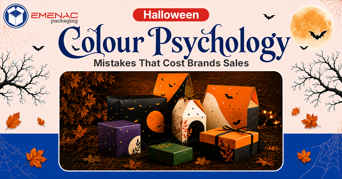
Every year, countless brands start thinking about spooky preparations before October 31st. Colour psychology plays an important role in evoking customers’ emotions, and when it’s associated with a particular event, it takes on even greater significance.
Halloween colour psychology isn't about forcing any colour into packaging; only certain colours work. Failing to use that colour psychology results in lost sales, impacting both brand reputation and revenue.
In this blog post, we will highlight the Halloween colour scheme mistakes brands should avoid this year.
What Should Halloween Colour Psychology Be?
Halloween is ghoulish, spooky, and frightful fun that starts on 20th October and continues until midnight on 31st. So, use colour psychology wisely for this spooky event.
Colour psychology for Halloween must balance the high-energy warmth of orange with the chilling mystery of black to create festive spookiness. What do both of these colours bring?
Orange: It brings warmth, social harvest fun, fire, and pumpkins.
Black: Black is often associated with darkness, nightfall, and the unknown. It adds a dramatic yet spooky touch to the event.
These two are the primary colours for Halloween packaging. But what other colours carry psychological weight, and what's the purpose of each?
Red: Symbolises danger and blood, heightening excitement and putting the brain on high alert.
Green: Recalls witches, slime, and decay. It plays on our natural aversion to contamination or rot.
Purple: It feels eerie and mysterious, yet supernatural and magical all at once.
Mistakes that Brands Often Make to Get it Wrong
Mistake #1: Treating Orange & Black as the Whole Strategy
This is the most common mistake that affects Halloween sales. Orange and black have become an overused design palette that looks too generic. The other issue is that these colours are common, as every second brand uses them on Halloween.
The mistake is not using orange and black. It’s using them without a strategy to keep themselves unique from others. Brands that incorporate different colours, rather than only sticking to orange and black, break visual monotony without losing the seasonal cue.
Mistake #2: Ignoring What Other Colours Actually Do
Almost everyone uses orange and black for Halloween, and there’s nothing special in this. Brands that use colours other than these create real differentiation, helping them stand out from the crowd.
Red, purple, and green are secondary colours that pair well with orange and black. When you skip these colours, you prove you are fighting for the same visual attention as everyone else- no competition at all, just generic packaging like others.
Mistake #3: Copying Competitors Instead of Reading the Audience
A common shortcut most brands often use is to copy last year’s Halloween packaging theme of competitors and simply replicate it with minor tweaks. This might feel like a big deal at first, but it makes your brand’s packaging difficult to sell.
The best strategy is to think about who your target audience is, what they actually need, and what the latest design trends are. Halloween packaging aimed at kids should not be like packaging designed for adults.
Mistake #4: Sacrificing Brand Identity for Seasonal Trends
One of the costliest mistakes brands make with Halloween packaging is abandoning core brand identity just to make it look fully Halloween-oriented. A customer who recognises a brand by its signature colours- how would they recognise your brand on Halloween with the same branding theme they remember?
Keep Halloween colours an accent, not a replacement. Don’t change branding elements like logo colour, a signature typeface, or a consistent layout just to redesign packaging for Halloween.
Mistake #5: Poor Contrast and Visibility
Heavy use of dark colours without sufficient contrast actually hurts self-visibility. This mistake makes packaging hard to see in dark and low-light environments. It results in poor contrast and low shelf visibility, causing Halloween packaging to get ignored no matter how beautiful the presentation is.
The best example of effective Halloween colour psychology is packaging that gets seen easily in the first place. For example, dark Halloween tones can be paired with a single high-contrast accent to maintain the balance.
Mistake #6: Inconsistent Colour Use
Some brands have multiple SKUs to run with, and using different colour schemes for each SKU is a costly mistake. The result? A product line that doesn’t show as a cohesive collection weakens brand identity and makes seasonal packaging feel scattered.
The best approach is to use a single colour palette that includes 2-3 primary colours and one accent. This approach must be used for all SKUs, with variation coming from layout or imagery rather than an entirely new colour scheme each time.
Conclusion!
Halloween Packaging is a rare chance for brands to experience mood, colour, and atmosphere in ways that wouldn't work the rest of the year. Experimenting well means understanding how Halloween colour psychology works.
Do you know this blog post gave you a golden tip on seasonal packaging? What is it? It is to be unique, not just copying the colour psychology everyone else is using. Work on strategies to avoid these costly mistakes before the upcoming Halloween drains your profits.
Emenac Packaging New Zealand is now accepting Halloween orders. Our custom printed Halloween boxes are made from quality materials with top-notch finishes, all while keeping the perfect colour psychology in mind. Feel free to contact us anytime.
Share This What Makes Custom Packaging Boxes so Beneficial for your Product?
 How Window Soap Boxes are Valuable for Your Brand Success?
 Matt Vs Gloss Lamination: Which One Is Better For Packaging
 Custom Kraft Packaging Boxes: An Ultimate Guide about Types, Design, and Printing
 Top 5 Reasons Why Small Businesses Use Custom Printed Gable Boxes